There are still some timing issues and the title shot needs a more interesting theme but right now half is done

Infographic: Storyboard


Storyboard! Going to make some assets for this next, oh and my handwriting is substituting any font styles for speed. The part with "the eggs however are planning something" (of all the things to talk about..) is rather hard to read but I am hoping that whole phase will be more understandable when animated together as a diagram! That or I will find another way to show it.
Film Review - Paprika (2006)
 |
| fig 1. Paprika film poster |
As Satoshi Kon's final film before his unfortunate death, Paprika marks the end of an influential reign of unique animated films. Similar to his previous films such as Perfect Blue (1999) and Millennium Actress (2001) Satoshi uses anime as a deliberate aesthetic choice in order to be able to achieve a level of surrealism not available otherwise. When faced with the narrative however, challenges some of the most serious film writers who deal with existentialism and reality. The combination of visual style with animation and ability to reflect adult themes in story, proves Paprika and Satoshi Kon's other works as stand-alone works of art that have gone on to influence other highly prolific directors such as Christopher Nolan.
Paprika follows a purposely disjointed and fragmented story about dreams and how they interact with reality; using imagery of bustling parades and over-sized toys to reflect childlike simplicity in humans having dreams. The music is also telling of this; invoking a spiritualistic sense of discovery, mixed with subtle darkness laying underneath. This is most apparent in the song "Parade" and "Byakkoya no Musume" (Girl of the White Tiger Field). Composed by Hirasawa Susumu the music made and adapted for Paprika is used often and in shots that show the dream world, or it crossing over into reality. By doing so creates a spectacle among what can only be described as only being able to happen in a dream.
 |
| fig 2. Parade of toys |
Among the anime style choices of Paprika, many of the classic tropes of an anime are present such as a notable "bad guy" and "henchman", which notably distract from the bigger idea of existentialism. Satoshi manages to use each character however to stand for something relating to the latter. Doctor Seijirou, the wheelchair bound villain increasingly becomes cartoonish in his "world-domination of the dream world", and even in trying to protect it. By the end of Paprika, as he becomes engulfed by the spirit of Paprika/Dr. Chiba it signifies not a completion of dreams, but more so conquering those who stand in the way. In this end scene, a reference is made to Evangelion and its own end, and whilst subtle parades its underlying themes of existentialism about the scale of one person and their dreams when compared with the scale of the world. Other references throughout Paprika are sporadic (fig 3. Paprika dressed as Sun Wukong) and often jokey, but seem out of place. He does manage to include a careful amount of culture - especially Japanese culture for example salary men and up-skirt camera shots in one of the last parades where the dream world hypothetically carries over into reality, but Satoshi's own commentary on it is missing. Regardless it presents the audience with enough freedom to be able to perceive the story Satoshi was trying to convey.
 |
| fig 3. Paprika dressed as Sun Wukong |
★★★★☆
Infographic: Test + Facts
I wanted to test if I was ok with After Effects.. Fact is irrelevant from the main "Scary Truth about...." angle however.
On top of this, I found some facts!
- Egg contains the highest quality protein you can buy.
- To tell if an egg is raw or hard-cooked, spin it! If the egg spins easily. it is hard-cooked but if it wobbles, it is raw.
- Egg yolks are one of the few foods that are a naturally good source of Vitamin D.
- Salt can be used to easily clean up a dropped egg.
- Yolk colour depends on the diet of the hen.
- Eggs left out at room temperature will age more than leaving it one week in a fridge.
- An average hen lays 300 to 325 eggs a year.
- Large eggs have 70 calories in them.
- It takes 24 hours for a hen to produce one egg.
- The older the hen the larger the egg.
- World Egg Day is on the second friday of October each year. (Doomsday for the creation of the double yolked egg?)
- Scientists estimate that, on average across the U.S., only 1 of every 20,000 eggs might contain the bacteria. So, the likelihood that an egg might contain Se is extremely small – 0.005% (five one-thousandths of one percent). At this rate, if you’re an average consumer, you might encounter a contaminated egg once every 84 years.
- Worldwide, around 1.2 trillion eggs are produced for eating every year. The average person on Earth consumes 173 eggs a year.
- Double-yolked eggs are often laid by young hens whose egg production cycles are not yet completely synchronized, or by hens which are old enough to produce Extra Large-sized eggs.
- Roughly one in every thousand eggs (about .1%) is double-yolked.


Infographic: Narrative

Several revelations.. I decided to put a nail in the coffin of which is the character for this project and move on swiftly from it. I want the infographic to have character, not be about a character. So here are some simple eggs with legs.. say hi they can't hear you
Anyway! Alongside a ridiculous story trying to convincingly explain that double yolked eggs are infact not such a spectacle and more common than you may realise.. There is also an example of their grand plan! It's hard to explain that specific scenario but here is a link: http://www.stuff.co.nz/oddstuff/8442801/Over-egged-chickens-double-barrelled-surprise
However, whilst difficult to explain in an entertaining way, it would be fun to make a diagram (almost step by step) of this grand plan!
The only thing I need to readjust is the implication that because we buy eggs with a single yolk they are for some reason not as tasty due to their loneliness stunting their potential.................. (i.e the scary truth)


「Maya Tutorial 」- Maps Part 5: Diffuse Maps - Stone Base


hey cool viewport tips i'll now use forever
Film Review - Mary and Max
 |
| fig 1. Mary and Max Film Poster |
 |
| fig 2. Mary and Max title shot, Mary's neighborhood |
In darkly coy fashion the 2009 full claymation film Mary & Max picks up that of which Harvie Krumpet (2002) did not have the time to do. Both Directed by Adam Elliot, the style of Mary and Max poses less to distract and more to aide the story of two lonely individuals from two completely different backgrounds become friends and eventually part ways. Mary and Max touches on sensitivities of mental health, disability and how we internally perceive the external using the desolate absence of fairytale magic to grimly show reality through the characters' eyes.
Though using clay, Mary and Max is less of a Wallace & Gromit and more of a Grizzly Tales for Gruesome Kids type of film. The characters' lives are contrasted with a warm (for Mary) and cold (for Max) hue, that does not go away even when the two eventually cross paths. Alongside the colour contrast the two characters differ immensely: Mary; being an eight year old Australian girl, and Max; a fourty four year old obese man living in New York. The only similarities they do share between one another is that of loneliness and unfortunate upbringing. Some - tedious and common, such as bullying in school, compared to more serious events that we see unfold as the 1 hour 30 minute film progresses. It must be said that it is not afraid to dive headfirst into issues that other films may either romanticize or play-down, but approaches them maturely, not to make a joke in the wrong place.
With a few references to Doris Day and Audrey Hepburn, they often felt misplaced and cheap compared to the rest of Mary and Max. However, as Que Sera Sera plays over the top of Mary's lowest point it brings attention to the lyrics being relatable to any young girl who had optimism for the future; contrasted by Mary realising that future and the effect of it.
The world of Mary and Max is set in a pseudo-modern time, phones not yet obsessively part of everyday life and so the two characters write back and forth between Australia and New York. A story usually revolving around long-distance involves two characters who are very similar; yet separated and unable to meet - often to create relatability to those in a similar situation. Director Adam Elliot however went for an approach in which both characters are vastly different. Though about how Mary and Max interact, we find far more out about their individual lives as the story progresses and how they become the people they do. Not only does it bring them together in the end, but equally tears them apart as the realities of their lives become all too much. The magic moment of "I can help you!" never arises, and even when the attempt is made; for example when Mary publishes a book on Aspergers, using Max as a case study; her intentions become shrouded in confusion. It highlights how simple acts even in attempts to help can become misinterpreted by those with Aspergers. As well as those who attempt to "cure" those of something that seems as permanent as an eye colour.
It becomes increasingly obvious that Max represents those with a disability, whether that be mental or physical. Mary on the other hand shows the life of a girl growing up who has a host of external problems around her. Instead of tackling both separately, Mary and Max uses each character to represent a wide audience yet still manages to appropriately bring to light what they experience. So much goes wrong over the course of their lives but does not seem reductive in execution. In this way Elliot does well to make Mary and Max accessible to watch by people struggling similar matters regardless how big or small.
 |
| fig 3. "teers for max" |
The world of Mary and Max is set in a pseudo-modern time, phones not yet obsessively part of everyday life and so the two characters write back and forth between Australia and New York. A story usually revolving around long-distance involves two characters who are very similar; yet separated and unable to meet - often to create relatability to those in a similar situation. Director Adam Elliot however went for an approach in which both characters are vastly different. Though about how Mary and Max interact, we find far more out about their individual lives as the story progresses and how they become the people they do. Not only does it bring them together in the end, but equally tears them apart as the realities of their lives become all too much. The magic moment of "I can help you!" never arises, and even when the attempt is made; for example when Mary publishes a book on Aspergers, using Max as a case study; her intentions become shrouded in confusion. It highlights how simple acts even in attempts to help can become misinterpreted by those with Aspergers. As well as those who attempt to "cure" those of something that seems as permanent as an eye colour.
It becomes increasingly obvious that Max represents those with a disability, whether that be mental or physical. Mary on the other hand shows the life of a girl growing up who has a host of external problems around her. Instead of tackling both separately, Mary and Max uses each character to represent a wide audience yet still manages to appropriately bring to light what they experience. So much goes wrong over the course of their lives but does not seem reductive in execution. In this way Elliot does well to make Mary and Max accessible to watch by people struggling similar matters regardless how big or small.
★★★★☆
Infographic: Characters


Lets keep these egg puns to a eggistentially low amount everyone
Now speaking of existential crisis', I drew these rough egg characters but currently all are too complicated for an infographic. Actually I would prefer the infographic not to be entirely obvious in its character elements and focus on animation with text to get some humour goin' but we'll see..
hey and a little irrelevant thing to this project but Mr. Selfridge has started again; in the 20's!!

Infographic: First Tests


I wanted to practice some clean design in Photoshop for quick aesthetic choices/rules to use in my infographic. Limited colour palette I feel is crucial here! In my head I'd like to use some small cardboard elements alongside the rest of the infographic's flat style to hopefully create a nice contrast. Egg boxes etc.. But first the narrative!


「Maya Tutorial 」- Maps Part 1: Base Normal Maps


When applying the normal maps onto the models I noticed they were not displaying properly even though the normal maps themselves were fine. After using normal maps with my fish model before I learnt that this specific issue is with the lighting causing seams at UV edges in Maya 2016 caused by the new colour management setup (I believe..). In order to fix this you must change the settings of the bump map file as shown below:
Set Color Space to: Raw
Tick the box that says "Ignore Color Space File Rules"
Then reload the image.


Adaptation B: Initial Ideas
 My initial ideas for the second part of the Adaptation project stem from the conceptual ideas behind film & book covers that are able to sum up a large narrative into a stripped down, conceptually strong image. Often this depends on the genre, as a Jane Austen book tends to go for a traditional approach whereas a Stanley Kubrick film pushes for the shrouded in meaning usually only possible to understand fully after watching. For example, Misery (the Stephen King novel + film adaptation!) could be summed up with the image of a typewriter or a pair of battered ankles.
I would like to adapt a film into a resolved "scene" in this manner, and in terms of film choice I have two that stand out at the moment..
- Juliet of the Spirits
- The Umbrellas of Cherbourg (Les Parapluies de Cherbourg)
The aim would be to sum up the film of choice into a fully 3D scene with all assets being modeled appropriately. As such it'll have a pipeline suited for film / CG rather than games allowing for far greater resolution and polys across the board as only one key shot is being rendered. Taking out animation almost completely from this pipeline the focus would be on quality of each individual asset/model, the textures and skill-wise the ability to conceptualize efficiently in a minimalist manner. It would need serious strength of composition!
♦
Juliet of the Spirits
The Umbrellas of Cherbourg


Though The Umbrellas of Cherbourg is a musical, and Juliet of the Spirits is not, the equally as lovely score written by Nino Rota would have to be captured in the image as well. Comparatively, The Umbrellas of Cherbourg has a fully sung script, using its distinct colour palette to an advantage as well.
「Maya Tutorial 」- Modelling Part 2: UV Layout

Ready for highpoly. Bring on the inevitable bevels !!!!!!!

「Film Reviews Submission Post 」
Film Reviews Submission Post
(Hyperlinked pictures!)
        |
The Hero's Journey: A Tree of Palme / パルムの樹 (2002)
Archetypes: The Rocky Horror Picture Show (1975)
3 & 5 Act Structure: Pulp Fiction (1994)
Character Relations: Viva Las Vegas (1964)
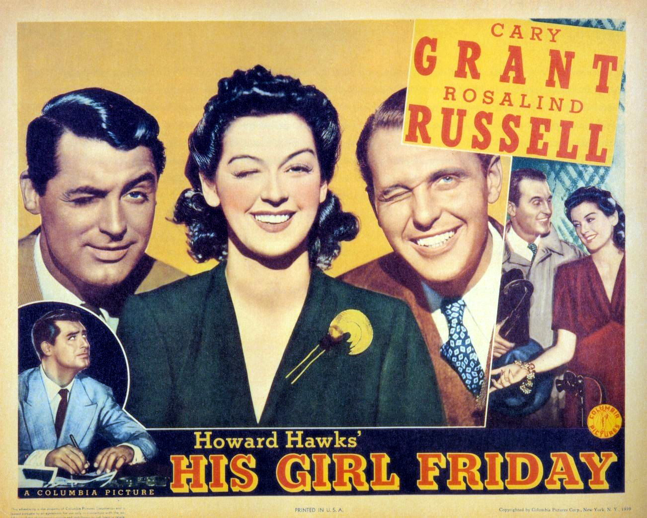
B Movies: His Girl Friday (1940)
Exploitation: Mad Max (2015)
Documentaries: Joanna Lumley's Trans-Siberian Adventure (Oct - 2015)
Adaptation: Breakfast at Tiffany's (1961)
Comedies: Absolutely Fabulous (1992 - 2003)
|
Subscribe to:
Posts (Atom)