What If Metropolis? - Building Doodles

I've been doing some doodles of possible mini-buildings in the city based off of some of Alvin Lustig's book covers. I'm aware that due to his architecture I cannot make things too organic; but must embrace sharp edges and sleek curves!

I also looked very closely at the textures of Alvin Lustig's covers once they'd be worn a little from age and use. It added a whole new level to his art, I think!


What If Metropolis? - Alvin Lustig First Look!

Anxiously Google'd Alvin Lustig into my phone, even though I had thought very hard about making sure not to overly-react to any certain artist if for example they had not been something "I liked"; I was pleasantly surprised by this very graphic yet slightly illustrative Artist and fell in love with his colour choice. It reminded me very much of Fosters Home for Imaginary Friends and whilst having a slight nostalgia trip I decided Mr. Lustig was someone who will (hopefully) improve my own design choices as I progress into this project!
 His architecture was extremely modern, and Bauhaus. Please stand for the dangerously pale cuboid structures. My memories of The Office's opening aside (2001 version!), it is not his architecture that has the same innate charm. They're a lot more stiff and definitely followed suit for the then upcoming glorious 60's... and so I am repelled back to his book covers! The idea of having "flat image" translate into 3D will be a challenge, but exciting nevertheless when I think about combing both 3D style from Lustig with some equally as styled flat planes, here and there..

Onto thumbnails perhaps!

Film Review - La belle et la Bête

(figure 1)

La belle et la Bête 

With the importance of a simple rose, La belle et la Bête uses magical outfit design and almost Shakespeareanacting to entise a sense of fantastical fiction with a simple yet whimsical story.
Vanity is at the centre of this arguably shallow film but throughout it does not hesitate to remind you that kindness somehow triumphs over deceit. Belle’s two sisters constantly scheming, jealous and whilst they could be considered appearance-wise to be as attractive; it is their personalities and actions which set them apart from Belle. As Bete constantly reiterates, the kindness that Belle shows is as tormenting as his own – with eyes filled with never-ending sadness. “A great honour”

The interstellar coincidence keeping Bête and Belle together is one of the many strings this film holds. Bête’s world of sparkling and detailed fine drapery combined with gothic architecture only adds to his overall apperance, (figure 2) purposely chosen by Jean Cocteau but on such a precise scale that not everything had to be considered. It “exemplifies the fact that sets need not be complex and elaborate to make a scene in a film spectacular. “(Stephens, 2009) There are two largely conflicting themes of the upper class and fine living that Bête has, compared to the ever-disappearing shoddy environment of Belle’s. – Which is to say strange at the least if you notice that they both live opposite lifestyles to their environment. Bête’s mindset is one to poverty though however humble Belle may be, hers is much more oppressively wealthier in character. Bête offers his wealth in exchange for her time, company and is ultimately humble to match Belle’s equally as humble self.

(figure 2)
With set design so carefully focused on portraying Bête’s past when asking the question “Why is Bête so familiar to a person?” It seems as if he turns more and more into a human with a soul; than that of a mindless creature the more he talks to Belle. Whilst Belle makes the observation that Bête’s voice has “gone soft” we soon realise Cocteau wants to create empathy for a beast blessed by Belle. “a Beast who is lonely like a man and misunderstood like an animal.” (Ebert, 1999) We are brought out of the gothic and dark architecture into a much more faerie and delicate environment. Outside, airy and open-spaced. Perhaps from the Vogue artist Christian Bérard (figure 1, 3) is what brings these dramatic designs to the laced and frilly table; but it creates an original and irreplaceable aesthetic that cannot be copied with ease. – Definitely not a downside to using an Illustrative Artist rather than a typical Concept Artist or Production Designer.

(figure 3)


La Belle et la Bête brings an underlying sense of shallowness which is often confronted when dealing with the issue of appearance, attraction and what we consider to be the monstrous or magnifique. Yet it deals with this in such an honest way there is no deceiving or back-handed psychology to derive from the simplistic of narratives.
“The pain of someone who is considered an outcast by society because of how they look on the outside will always be there and will never leave, as long as people will always be scared towards those who are different.” (Matthew, 2012)


---


Illustration List

Bérard, C. (1946). La Belle et la Bete Alternative Poster Art. [image] Available at: http://payload273.cargocollective.com/1/2/88505/7772852/04-Beauty-and-the-Beast-1946-Jean-Malclez_900.jpg [Accessed 28 Oct. 2014].

Cocteau, J. (1946). La Belle et la Bête. [image] Available at: http://theredlist.com/media/database/settings/cinema/1940-1950/beauty-and-the-beast/039-beauty-and-the-beast-theredlist.jpeg [Accessed 28 Oct. 2014].

Cocteau, J. (1946). Film Still 1. [image] Available at: http://i.gyazo.com/f127369d46fa0f895808f1175e5a845a.png [Accessed 28 Oct. 2014].


Bibliography

Matthew, (2012). Beauty and the Beast Criterion Foreign Film Movie Review 1946. [online] Available at: http://www.classicartfilms.com/beauty-and-the-beast-1946 [Accessed 28 Oct. 2014].

Ebert, R. (1999). Beauty and the Beast Movie Review (1946) | Roger Ebert. [online] Rogerebert.com. Available at: http://www.rogerebert.com/reviews/great-movie-beauty-and-the-beast-1946 [Accessed 28 Oct. 2014].

Stephens, I. (2009). film110 / Mise en Scene in La Belle et la Bete. [online] Film110.pbworks.com. Available at: http://film110.pbworks.com/w/page/12610265/Mise%20en%20Scene%20in%20La%20Belle%20et%20la%20Bete [Accessed 28 Oct. 2014].


Stephens, I. (2009). film110 / Mise en Scene in La Belle et la Bete. [online] Film110.pbworks.com. Available at: http://film110.pbworks.com/w/page/12610265/Mise%20en%20Scene%20in%20La%20Belle%20et%20la%20Bete [Accessed 28 Oct. 2014].

INVISIBLE CITIES - FINAL CRIT PRESENTATION

Film Review - Alien

figure. 1


figure. 2
The original film of a three-part series that stemmed into games and collaborations with other titles (Such as Alien vs Predator) boasts art of H.R Giger and the directing abilities of Ridley Scott into a jump-fest of a film. Almost beginning like 2001: A Space Odyssey, there is something missing. A much more sinister tone which screams something being wrong from the beginning. We are shown pale white rooms in which people wake up from being asleep for what seems like eternity. The scene is quite angelic. They’re groggy, but ultimately human. Thus Cereal and Cigarettes commence!

figure. 3
With the ability for this film to go from mechanical and hard-surface to organic shapes in such a subtle way, using the late Giger’s genius, a large narrative is formed around the juxtaposition between the two. (figure. 3) Alien’s ever changing abilities to blend into the harsh sci-fi surroundings is what sets it apart from the others. “familiarity consumes the promise and leaves as residue the memory of some shrieks from shocks of a most mundane kind.” (Canby, 1979) Whilst Ripley is being hunted down by Alien (figure 4.) on the ship it is constantly changing, finding ways to almost sympathetically play with Ripley. Looking back on the film after watching it, it feels like an eternity even. The pacing in Alien is phenomenal but has the action and thrill of discoveries to back it up. “It takes its time. It waits. It allows silences” (Ebert, 2003)
Whilst the story isn’t complex, the relationships between the crew members, and Ripley with Alien are more notable. From the beginning Ripley has an essence of morbid curiosity in a way that she is fearful but also simply curious of what could kill her if she makes one wrong move.

figure. 4
The most powerful asset to Alien’s success could be how brutally unfair it is. There is no movie magic which somehow allows everybody to survive a tragedy, and instead focuses on the desperation and turmoil that these individuals have no chance of going up against one verses one. They are all aware of this and as such there is no successful heroism. “Each of the members of the crew come face-to-face with the Alien in sequences where the mise-en-scene is coded to suggest an intense feeling of isolation” (Buckle, 2011) The strength of emotion because of this could not be any clearer. U jump-scares to it’s best ability without relying on them too much we are left at the end feeling a sigh of relief once we completely know that the Alien is gone, though there is still an essence of hopelessness that can never be shaken throughout Alien as well as the whole series. 

figure. 5

Illustration List:

 Figure 1: Scott, R. (1979). ALIEN MOVIE POSTER. [image] Available at: http://www.impawards.com/1979/posters/alien.jpg [Accessed 23 Oct. 2014].

Figure: 2Scott, R. (1979). [image] Available at: http://puu.sh/cnWo0/56778baddb.png [Accessed 23 Oct. 2014].

Figure 3: Scott, R. (1979). Film still 1. [image] Available at: http://puu.sh/cnXej/beac14d41c.png [Accessed 23 Oct. 2014].

Figure 4: Scott, R. (1979). Film Still 2. [image] Available at: http://puu.sh/cnYBq/dc490b4018.png [Accessed 23 Oct. 2014].

Figure 5: Scott, R. (1979). Film Still 3. [image] Available at: http://puu.sh/cnZl4/d04585eb60.png [Accessed 23 Oct. 2014].


Bibliography:

Buckle, A. (2011). The Film Emporium: Critical Analysis: Alien (Ridley Scott, 1979). [online] Thefilmemporium.blogspot.co.uk. Available at: http://thefilmemporium.blogspot.co.uk/2011/03/critical-analysis-alien-ridley-scott.html [Accessed 23 Oct. 2014].

Canby, V. (1979). Movie Review - Alien - Screen: 'Alien 'Brings Chills From the Far Galaxy:A Gothic Set in Space - NYTimes.com. [online] Nytimes.com. Available at: http://www.nytimes.com/movie/review?res=950CEED61439E732A25756C2A9639C946890D6CF [Accessed 23 Oct. 2014].


Ebert, R. (2003). Alien Movie Review & Film Summary (1979) | Roger Ebert. [online] Rogerebert.com. Available at: http://www.rogerebert.com/reviews/great-movie-alien-1979 [Accessed 23 Oct. 2014].

Invisible Cities - DVD Cover


Tiny text at the bottom of things makes it seem legit.

Invisible Cities - Moriana Final Compositions (Before Colour!)


2 of the roughs for my final 3-Piece. Really trying to push scale! Thoughts???

Perspective Exercises


These double as perspective excersizes as well as rough ideas for my final images! Unfortunately, the FOV (Yay, something games taught me!) is way too narrow/zoomed in and probably won't show enough information about Moriana that I would like. I want to be able to use perspective as a rough guide so that my drawings don't look mechanical. Focusing on lineart was not the focus, moreso getting bulky forms down. - Paint was going straight over the top of it anyway!

Film Review - 2001: A Space Odyssey

A SPACE ODYSSEY


Fade to Space. Glaringly bright light, and Stanley Kubrick’s signature cinematic shots, symmetrical. As the music slowly builds up and the glare from the Sun breaks through the atmosphere of the Earth, there is a certain element of something impending on you soon. “But it makes you wait. Its five bold opening notes embody the ascension of man into spheres reserved for the gods. It is cold, frightening, magnificent.” (Ebert, 1997) For such a calm and slow shot it builds tension, and suspense. You want the Sun to be in full view but are also scared what will happen when it does.


figure. 1

With an extremely symbolic yet slightly foreseeing beginning, the 1968 film 2001: A Space Odyssey starts with the dawn of man. Apes are shown living their lives, and frankly not much else; whilst becoming partially sentient they are still only apes. Kubrick’s film up to this point had looked like a nature documentary until one of the most important yet simplistic assets to this film appears. The Monolith. (figure. 2) The Apes are confused by its static appearance and so is the audience. We don’t understand what this object is and neither do the apes. Relating us back to the age old theory that we are derived from Apes. Hence, the dawn of man.  A bone into a spaceship…

We skip into Kubrick’s 2001. Spaceships, space and classical music! Futuristic planes that look all too familiar yet different. Women dressed in slimming though simple outfits to help them walk slowly around in anti-gravity, not for the attraction but as an asset to the ship. All of these things are considered and the more you see the more you realise every single item in Kubrick’s 2001 Space explorative world is re-designed but not too far away from normality that we feel alienated. Kubrick knows when and not to evoke uneasiness but this is not one of those times. As Johann Strauss II’s “On the Beautiful Blue Danube” plays in the background it is clear Kubrick wishes for us to be just as amazed by the idea of future space-exploration for the masses as he is!

2001: A Space Odyssey shines in the regard of revelling in its own genius. “Moments of sheer brilliance and it is undoubtedly their stark visual power that lends this piece of cinema its famous visionary qualities.” (Haflidason, 2009) Nothing apart from the monolith is pushed forward to be noticed, withal but being the most simple. No questions are asked in the film, and Kubrick tries all too hard to not have an answer to your own. You are slowly fed strands of stunning visuals with almost ulterior conversations in the middle, patience endued the story eventually becomes apparent.  This is where 2001 becomes an oddity of it’s own. There is such strong symbolism and concrete visuals that the actual narrative of the film is hazy.  Arguably, there might not be one, but it leaves everything but the visuals up to your imagination as to what the film entails. As Kubrick’s imagination runs wild with the idea of space travel yours does too figuring out just what Kubrick is trying to tell you. This is not a story of politics or karma, but philosophy and the human race.

The Monolith seems so outer-worldly yet has opera-like voices radiating from it. Sounding menacing, but ultimately, human. This 
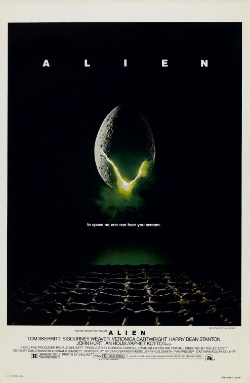
distinguishes 2001 from many other Space-travel related films (such as Alien 1979 and Forbidden Planet 1956) in which it does not deal with Aliens in Space. Any problems that Dave faces are not against Aliens, but against something manmade. Dave against HAL, Apes against Apes. Everything is circulated around mankind. From beginning to end. You could say it is making a point about what our nature as a species is rather than a story based on fiction. Perhaps cynicism from Kubrick’s part; or just a simple observation.


figure. 2

With intermission included, 2001: A Space Oddyssey is almost 3 hours long. A slow-paced and almost dormant movie, but with good reason. Every slow shot makes you analyse and reflect on what you had previously seen, but not ahead. “it's through the film's silent, deliberate hypnosis that it achieves its ballet-like majesty, with every painterly image and effortless pan and cut communicating not only a necessary narrative/emotional cue, but the wordless beauty of mankind as a creative, conscious entity at work in the universe.” (Humanick, 2007) Scenes so still but with sudden change to another, you are left processing what you witnessed before without a chance or even inkling to what comes after.

HAL-9000 is the only life form that does not resemble nor come from the physical being of man-kind. The monolith is never present when HAL is around and only when HAL has been ridden of does the Monolith finally appear, back to Dave, the human. As well as the Monolith, there is an absence of music too. Infact, from the first mention of HAL up to the psychedelic breaking point of the film, there is no music at all. As the sequence of struggle against HAL continues the feeling of impending doom builds yet again further and further, lowering it slightly each time a false alarm created by Kubrick happens – Creating the spontaneous and un-guessable future this film holds as mentioned earlier.


figure. 3 
The one part of the massive psychedelic shift change of 2001: A Space Odyssey that really stands out apart from it either being film filters galore, or a distanced philosophical look on the world we inhabit, is Dave’s eye. (figure. 3) It can only be described as the “Predator Shot” and is frequently seen with animals before they are being hunted. We focus on the eye, it emotes the most feeling and depth. This brings us back to the main clause of the film. The dawn of man. At the beginning of the film the Apes are hunted by other Apes, man vs man. They are their own predator and prey. Equally, we are shown this as Dave being the prey but we do not know what to. That will remain a mystery as Kubrick does not give you a point-blank resolution to 2001: A Space Odyssey. The subject of much debate as to what the 1968 Sci-Fi film really was trying to get across. But remember, no matter the perhaps morbid outcome to the film, in the great words of HAL-9000, 
"Everything is going extremely well."


figure. 4


------------


Illustration List:


Fig. 1 - Kubrick, S. (1968). Film Still 1. [image] Available at: http://puu.sh/cliCs/531a3e9bfc.png [Accessed 21 Oct. 2014].

Fig. 2 - Kubrick, S. (1968). Film Still 2. [image] Available at: http://puu.sh/clmkC/5a5d23ff4e.png [Accessed 21 Oct. 2014].

Fig. 3 - Kubrick, S. (1968). Film Still 3. [image] Available at: http://puu.sh/clp7A/87dad2a050.png [Accessed 21 Oct. 2014].

Fig. 4 --Kubrick, S. (1968). Film Still 4. [image] Available at: http://puu.sh/clqfj/255f6d64e2.png [Accessed 21 Oct. 2014].

Bibliography:


Ebert, R. (1997). 2001: A Space Odyssey Movie Review (1968) | Roger Ebert. [online] Rogerebert.com. Available at: http://www.rogerebert.com/reviews/great-movie-2001-a-space-odyssey-1968 [Accessed 21 Oct. 2014].

Haflidason, A. (2009). BBC - Films - review - 2001: A Space Odyssey. [online] Bbc.co.uk. Available at: http://www.bbc.co.uk/films/2000/09/18/2001_review.shtml [Accessed 22 Oct. 2014].

Humanick, R. (2007). 2001: A Space Odyssey | Film Review | Slant Magazine. [online] Slant Magazine. Available at: http://www.slantmagazine.com/film/review/2001-a-space-odyssey [Accessed 21 Oct. 2014].


Further Reading (FYI:)
Forbidden Planet (1956): http://www.imdb.com/title/tt0049223/

Life drawing Wednesdays! 01

 The first life-drawing class was a (definitely man-made!) structure. I took some pictures that I thought had great premise in terms of composition!


Artist Who's Who!


Short and sweet!

Invisible Cities - Moriana Inside Compositions 2


More inside shots, this time a darker take from an average home rather than one that's slightly more privileged.
 
 
Doing this on a higher saturated screen and then looking at it on another makes it look very de-saturated.  That's kinda annoying!

Invisible Cities - Moriana Inside Composition Perspective fix

 
I talked with Jordan about the piece I did yesterday. For one of my final shots I'll keep the same idea as this with the beam obstructing the view slightly, but fix perspective issues. On this piece the beams were slightly lower than they should be, making the overall scale of it look off.

Invisible Cities - Moriana Inside Composition


Inside atmosphere piece! Also wanted to see if I could get the right atmosphere inside the individual houses. A very childish house.

I think my scaling might be off.

Invisible Cities - Moriana Colour Compositions 3


Some more comps, this time with ~*civillian interaction*~ 
Not entirely sure that these fit the mood, the left might but the right has the wrong feeling. I wanted to try and see if the contrast of a very warm climate with sand for miles mixed with a focal point of Moriana itself could work. - Though I'm not so sure now.

Sketchies of the week


Invisible Cities - Moriana Research + Influences


I WILL NOT APOLOGIZE FOR THE TERRIBLE JOKE I MADE
viva la rocks shaped like stars

Anyway, I've been looking at some more visual references rather than basing my concepts off "feeling" as I think you need both combined to make something successful! Violently looking for inspirational impressionists, too. Did some research into different rocks that could be found in my city and learnt the specific name of "Howlite". It comes in white too! But I was going off the memory of being a child and having that one pet fish, they'd always sell garishly multicolored rocks for the bottom of the bowl.

Invisible Cities - Moriana - Colour Compositions 2


Experiments with using colour dodge! I think if it's overused it can make something look overly digital, which I want to stay away from. There is a very specific glare you get from the sun when it hits water, and as Moriana is in a giant fish bowl to say, I imagine it would reflect light sometimes rather strongly. But the bottom of the city would still be extremely dark and dusty with slight glimmers from the sun.

I feel like I need more specific references and inspirations to work from to add some believably in the city, at the moment. 

Invisible Cities - Moriana - Colour Compositions


Some colour comps for the second to lowest level of Moriana. Looking above the houses are supposed to look towering as they are raised massively off the ground. There are endless paths on the base level where civilians walk to get around, but a lot of these paths also lead to many of the stops for the water current tube system. (I should probably come up with a name for that..) "Dead houses" are ones that have sunken down into the depths below. The stalks that the higher houses are raised upon eventually fall down. 

Invisible Cities - Moriana coloured sketch


Coloured this, finally. Took a while. The building in the middle looks like a face and now I can't unsee it. Been trying to use more impressionist techniques but aahdfjkddakljfgkjgf it's hard to keep form at the same time. It has at the very least given me a good view on what colours do and do not work.

Invisible Cities - Moriana houses + sketches


I want to colour these tomorrow as I've been thinking of adding some vibrant yellows to contrast the blue. I'm using the description of a "hidden face" to add physical layers to this city as well. Very organic "cluster" shapes. Similar to a coral reef you would find on an ocean bed.

Maya Tutorial - Texturing Part 1 - Common Shaders


Many, many renders!


Maya Tutorial - Digital Sets - Part 1 // 2

I finished the main building parts of the Digital Sets tutorial  as well as started to move on to the UV mapping. The lamp-post was fun!


KEEP PRESSING BEVEL AND INSERT EDGE LOOPS UNTIL YOU MAKE AN ITEM

Film Review - King Kong (1933)

Figure 1

King Kong (1933) 

King Kong, 1933, was the original and predecessor to the 2005 remake. It certainly was a trademark of the time for better or worse, featuring a dashing damsel in distress and a gargantuan-sized Ape. A real story of Beauty and the Beast.
Fay Wray plays Ann Darrow, a naïve and somewhat desperate New Yorker in need of any glimpse of a job. You get the impression from her carelessness and over trusting behaviour that she’d wind up in a bad situation if in the wrong place at the wrong time. Thankfully, Carl Denham and his “thrill of a lifetime and a long sea voyage that starts at six o'clock tomorrow morning.” arrives swiftly. Although Ann’s almost too sudden approval of the opportunity seems a little too much like fast-paced movie fantasy the rest of King Kong does not follow suit. But before we get into that, a final point. – It is interesting that the “love interest” expected does not come from Denham himself. Infact he seems completely removed from the idea of having a woman on the set of his movie. This perhaps correlating with the ever present sexism that was current at the time of King Kong’s release; however subtle that may be.
When watching King Kong today, the sexism, racism and off-putting animatronics all seem to generate a certain type of tongue-in-cheek type of humour. “"King Kong," which, in this age of technical perfection, uses its very naiveté to generate a kind of creepy awe.”(Ebert, 2002) As that was not the intention at the time you have to wonder if in 1933 people were nodding along gratuitously, amazed and captivated by this massive Ape whisking away the “Queen of Scream” in what all they know to be defined by an over-dramatization of real life identification.
It would be more appropriate to focus on set design and the methods they used to create the ever-so mysterious “Skull Island” rather than racism and sexism all too common for the time and thus arguably being forgivable. With uses of stop-motion, matte paintings and an extreme sense of sleight-of-hand King Kong is a marvel of “home-made” special effects. “home-made” mainly for the physical premise they hold in King Kong unlike of which today where close to everything is digital. It is a lot less forgiving.
Figure 2

Figure 3
King Kong has the strangely “twitchy” style similar to that of Dark Crystal (1982) and The Never-Ending Story (1984) of which both used animatronics. King Kong however, does not have the same level of fantasy and instead replaces it with action. “But this is King Kong! The second you remember this movie was made in 1933, awe washes over you.” - (Telsch, 2014) As I mentioned earlier, towards the beginning of the film Ann’s decision to go along with Denham has almost zero doubt associated with it apart from her questioning if she would be the plight of a sexual favour.  (Women, huh? Always assuming everything...) Apart from this she hastily accepts Denham’s request and hops on a boat with him the following morning. Whilst this is ridiculously “at the last minute” and with no reluctance the rest of the film does not pan out this way. Infact, we are carried through a metronome of King Kong’s appearance as he appears and disappears trying to keep Ann for his own.  Unfortunately it seems every breathing inhabitant of Earth is trying to get hold of her and thus Kong must slowly fight his way through several almost seemingly too well placed enemies. (There’s that Hollywood coincidence!) The fight scenes after a while become monotonous with sporadic punch after another becoming seemingly less exciting each swing. In terms of direction, this is the largest asset that lets King Kong down.
Figure 4
Figure 5
I wanted to make a comparison to the 2005 remake of King Kong as in an essence it becomes a completely different movie. There is a large amount of empathy from the viewer for the large Ape and his desperate attempts to keep the seemingly frail blonde woman in his grasp. Whereas in the 1933 version Kong is much more brutish. Maybe the lack of “sparkly CG eyes” is the cause, coupled with no moments of reflection, but it still remains that Kong is much more animalistic and emotionless than the 2005 remake. “The throbbing heart of the film lies in the creation of the semi-human simian himself, an immortal tribute to the Hollywood dream factory's ability to fashion a symbol that can express all the contradictory erotic, ecstatic, destructive, pathetic and cathartic buried impulses of 'civilised' man.” - (Time Out London, 2010)
Emotion does not come from budget, of which the 2005 version had 207 million USD to spend compared with the measly $672,000 then of the original.

The original King Kong is a more primitive take on Beauty and the Beast, infact, more realistic because of how unforgivingly brutish and disconnected from sympathy and hope from Kong’s part. Beauty killed the Beast, but if the ever-present movie magic was not there, the Beast would have killed Beauty far sooner than we would have liked whether that be an accident or not. Maybe then we would have seen Kong’s true aggression in a much more ruthless Kingly way.


------


Illustration List:

Figure 5 - Jackson, P. (2005). King Kong 2005 Photo. [image] Available at: http://www.wallpaperglow.com/wp-content/uploads/2014/07/Naomi_Watts_in_King_Kong_Wallpaper_21_1024.jpg [Accessed 14 Oct. 2014].

Figure – 3 Petersen, W. (1984). The Evil Wolf from The Never Ending Story. [image] Available at: http://www.neverendingstory.com/images/Image128.jpg [Accessed 14 Oct. 2014].

Figure 1 - Schoedsack, E. (1933). King Kong Poster. [image] Available at: http://www.cynephile.com/wp-content/uploads/2010/08/king_kong_movie_poster.jpg [Accessed 14 Oct. 2014].

Figure 2 - Schoedsack, E. and Cooper, M. (1933). King Kong Film Still 1. [image] Available at: http://puu.sh/ccp5f/a2039582a2.png [Accessed 14 Oct. 2014].

Figure 4 - Schoedsack, E. (1933). Kong Fights Pterodactyl. [image] Available at: http://4.bp.blogspot.com/_Y32nBaee2kw/SlVK_yCRRrI/AAAAAAAAAYg/6lFQ2EfQcnk/s400/kingkong-wobrien-1933%5B1%5D.gif [Accessed 14 Oct. 2014].


Bibliography:

Ebert, R. (2002). King Kong Movie Review & Film Summary (1933) | Roger Ebert. [online] Rogerebert.com. Available at: http://www.rogerebert.com/reviews/great-movie-king-kong-1933 [Accessed 14 Oct. 2014].

Telsch, R. (2014). King Kong (1933) DVD Review. [online] Cinemablend.com. Available at: http://www.cinemablend.com/dvds/King-Kong-1933-1254.html [Accessed 14 Oct. 2014].

Time Out London, (2010). King Kong. [online] Available at: http://www.timeout.com/london/film/king-kong-1933 [Accessed 14 Oct. 2014].


Further Reading (FYI):